


I kicked off the project by running a discovery workshop in FigJam with the Product Owner, Product Manager, Lead Developer, and fellow Product Designer. We identified platform needs, business goals, and known user pain points.
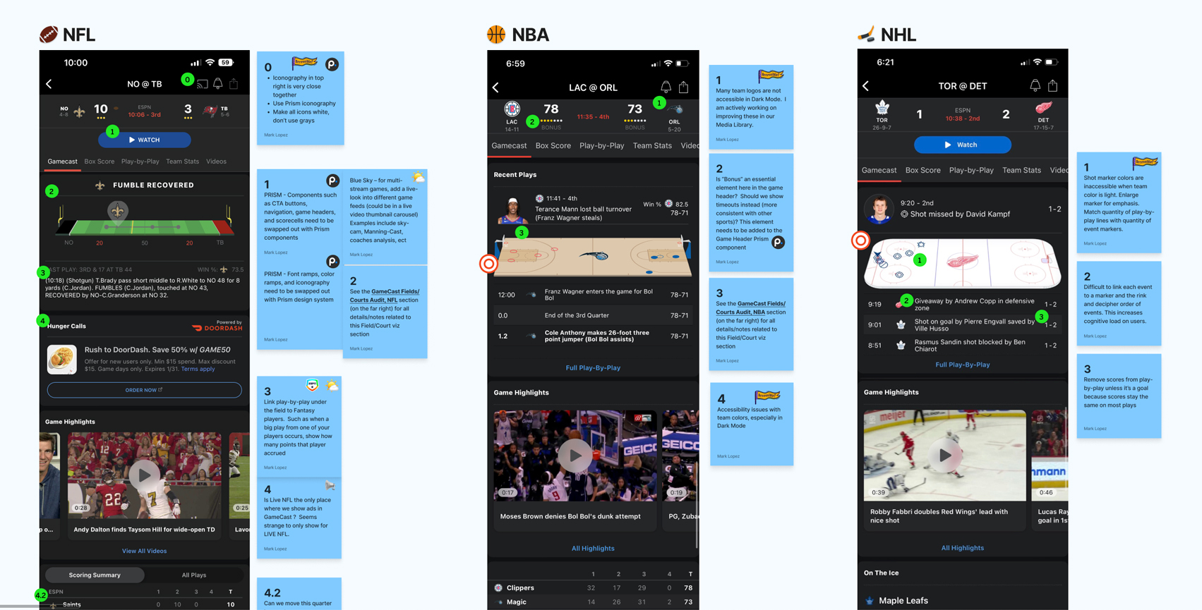 Next, I evaluated the existing Gamecast experience across NFL, NBA, NHL, and soccer, taking screenshots and then annotating usability findings between pregame, live, and postgame states. In conjunction, we did a competitive analysis of comparable apps' Gamecast experiences and analyzed customer support logs. Key takeaways were a lack of accessibility (especially with team colors), inconsistencies between components, lack of a uniform design system, a need for personalization, and the intrusiveness of ads.
 From here I collaborated with our UX Research team to identify additional user needs of the existing product. My colleague and I wrote recruitement criteria and outlined the testing goals. Next we created base level Figma prototypes and the UX Research team conducted user interviews and moderated user testing through UserTesting.com. I observed, helped document findings & data (primarily qualitative), and then the research team presented them to the stakeholders. The summary of findings revealed the users' desire for speed and efficiency, betting & fantasy integration, personalization, and increased interactivity. Based on this and previous research we split the project into 2 phases: quick win enhancements and large scale improvements.

 Our research revealed inconsistencies between styles, modules, and the assets within them. As part of Phase 1, we updated the components to use ESPN's latest design system, called Prism (used across Disney), which uses a color ramp for both light and dark mode (shown above), contextually defining when to use each color. It also pulls from a type ramp that can flex between desktop and mobile breakpoints.
 I also helped construct the libraries for ESPN branded Prism universal components such as CTA Buttons, card collections (shown above), navigation, and controls, used as the foundation to build content-rich components across our apps and website.
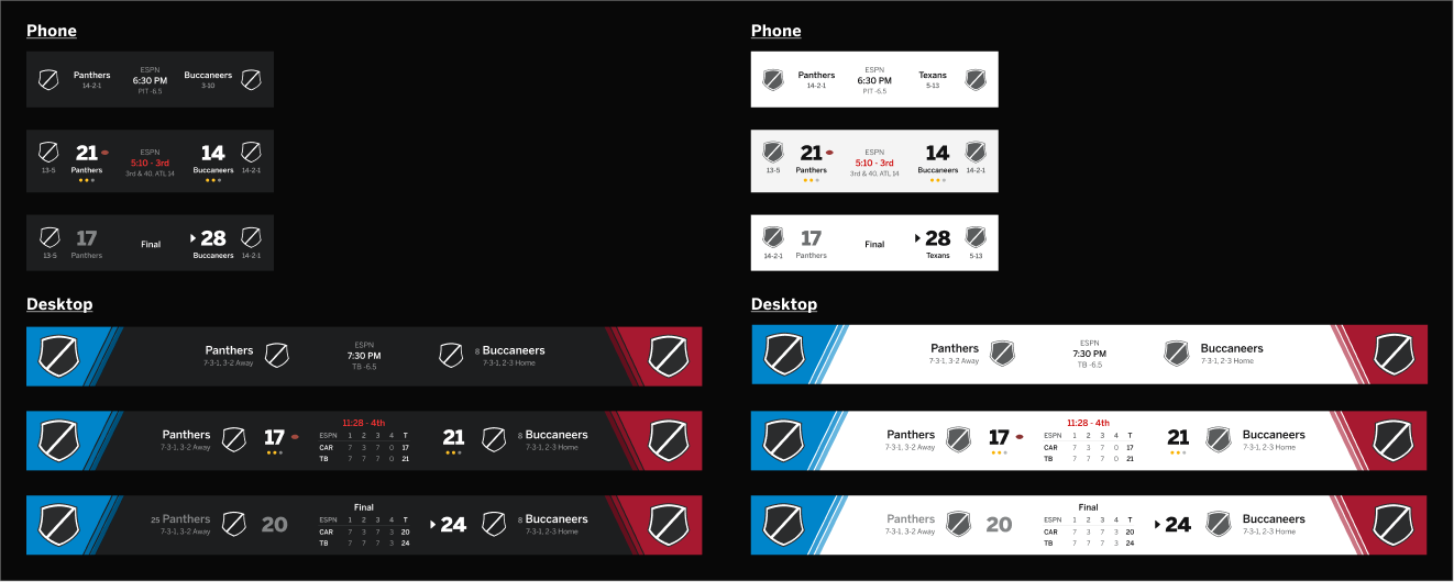 Additionally, in order to make Gamecast modules more consistent and accessible, using Prism I created components specific to ESPN such as Game Headers using Figma variants (see image above). Game Headers are the scoreboard headings found at the top Gamecast. Similarly, I created base components for Scorecells, which are condensed versions of Game Headers used across Gamecast and globally to display a collection of scores in rows.
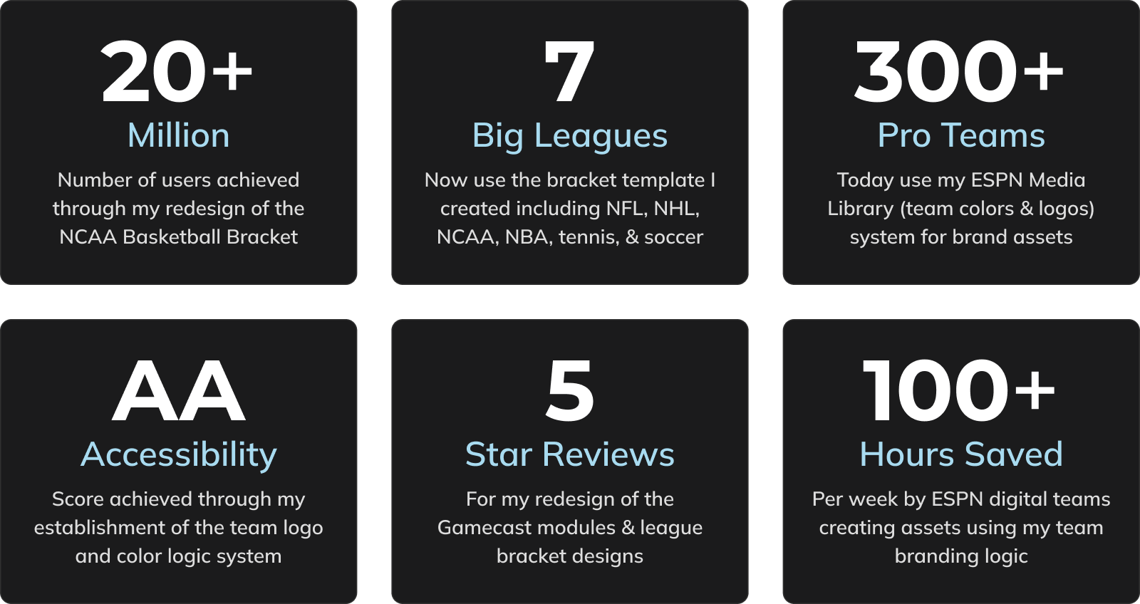
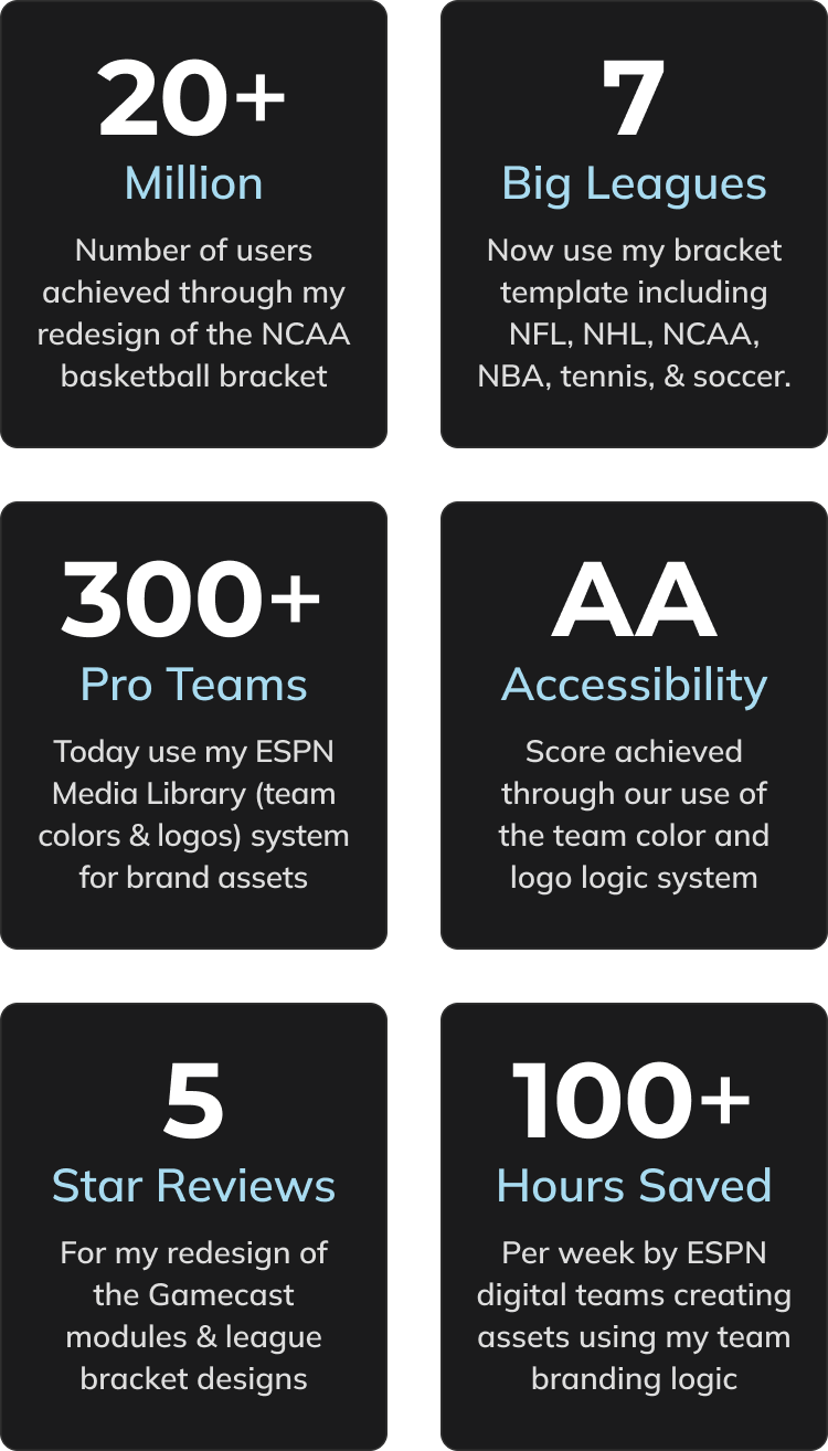
 In parallel, I built out the ESPN Media Library (in Figma) composed of team logos & color swatches across the 6 major sports leagues and 300+ teams. A primary user pain point was the contrast accessibility of team colors within data visualizations. In response, I created a flow document to establish logic for our devs to dynamically generate accessible team colors. I also created team branding accessibility guidelines for our designers and devs.
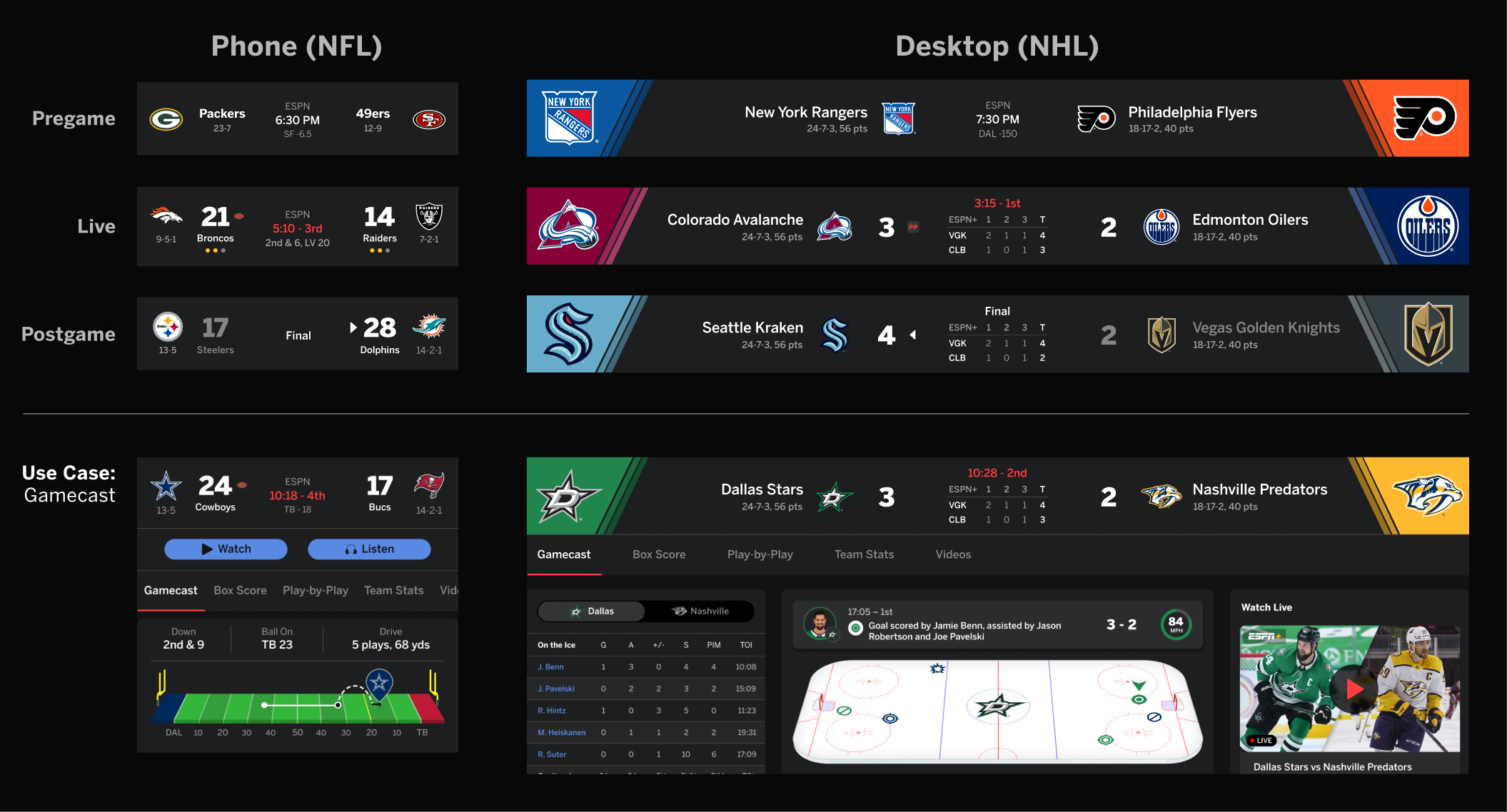 Combining the base Game Header component and linking to the ESPN Media Library, I built out content-rich templates for Game Headers (shown above) for the big 6 sports leagues that flex across all breakpoints. I also created content rich templates for Scorecells which can expand out to include betting odds (when user turns on the feature).

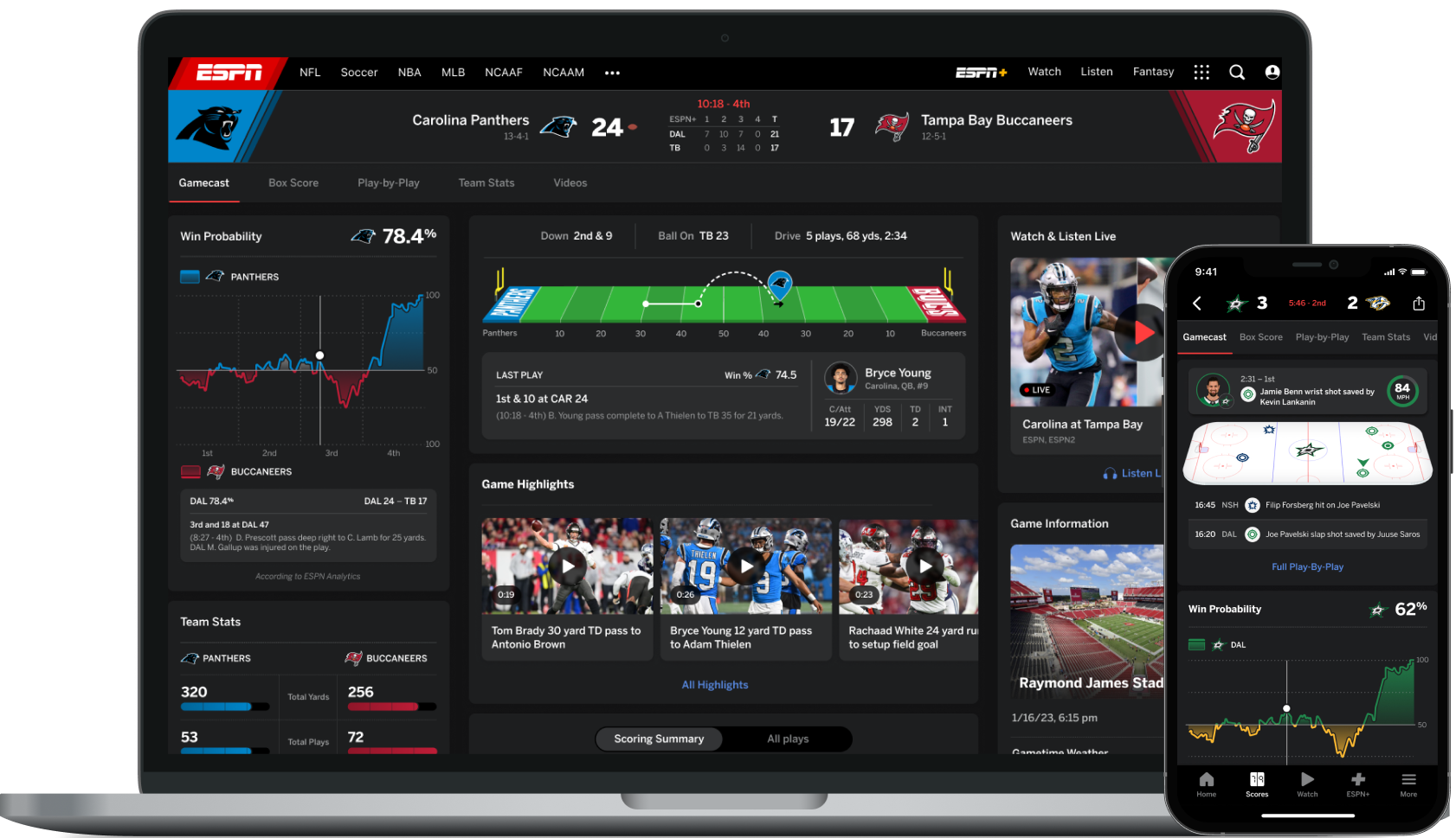
Using the Gamecast evaluation, user research, and the design system, I redesigned Gamecast starting with NFL in high fidelity. Phase 1 included making it more accessible, adding consistency across modules using the Prism design system, enhancing the data viz, and increasing interactivity. Modules that I redesigned included the field/court/rink graphics, play by play, stats and betting data viz, game headers, and game info (weather, attendance) across all breakpoints. Once NFL Gamecast was complete, I modified its modules to accomodate content/data for the NHL (see below), and then later the NBA (with betting odds example), NCAA football, MLB, and soccer.


Using the same design system and linking directly into Gamecast, I also led the redesign of the NCAA March Madness brackets for ESPN.com. The Product Owner wanted to optimize the bracket for mobile and update it to be more interactive, consistent, and accesssible. I utilized the scorecell base components to create the each individual game card and the logo and team color logic to create the championship banners.


Lastly, here is a side-by-side look at some of the major Gamecast modules before and after my redesign!


