



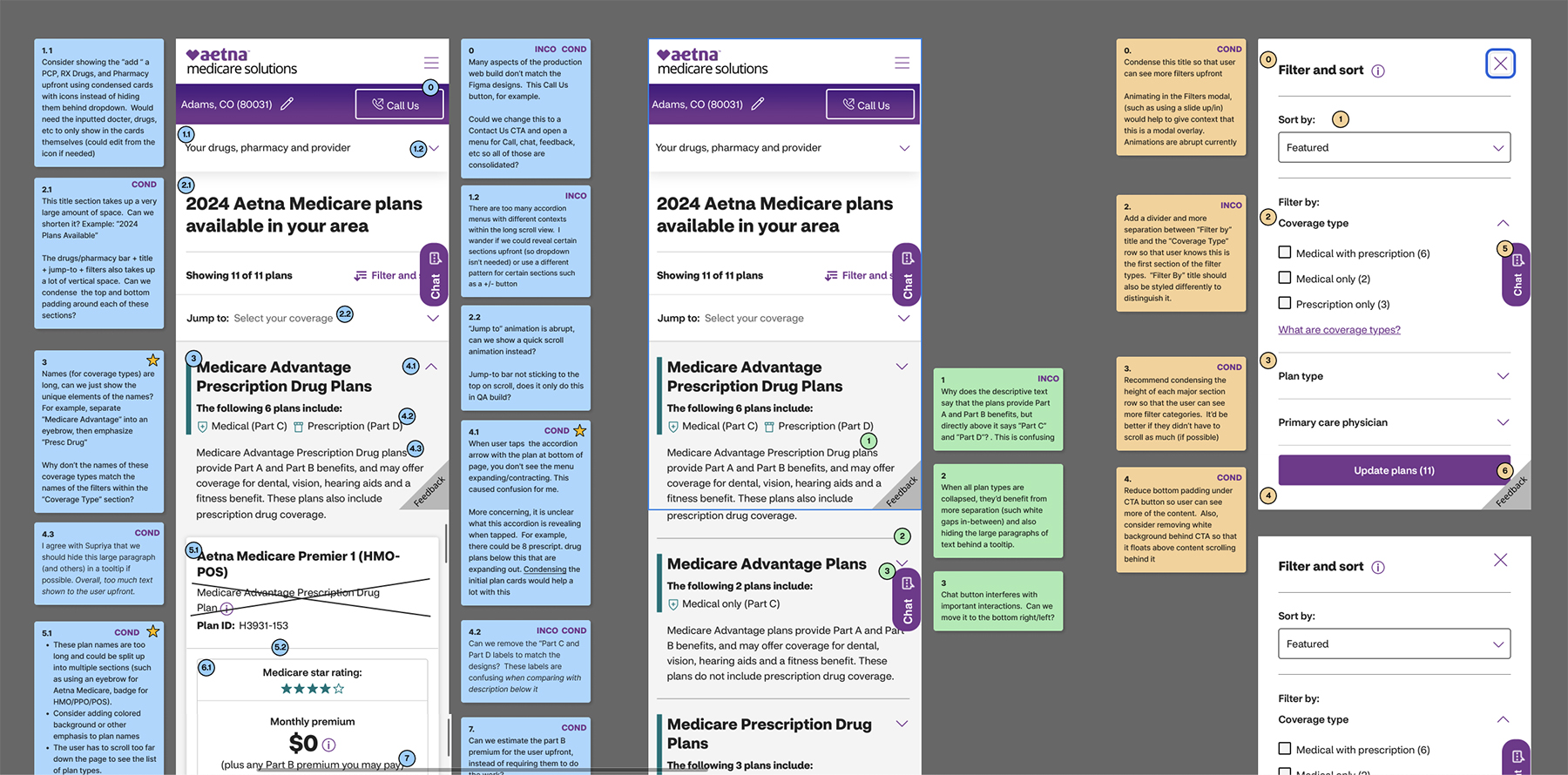
After establishing project goals and reqs with my Product Owner, Creative Director, and Content Manager, I conducted a UI/UX audit in Figma of the existing mobile web experience. I documented usability and UI pattern findings/concerns using sticky notes (see above). In conjunction, I ran a competitive analysis of websites for United Healthcare, Humanaa, and Medicare.gov. Lastly, I compiled user feedback from previous user tests and product owner input. I consolidated the findings into key research takeways and presented them to the stakeholders.
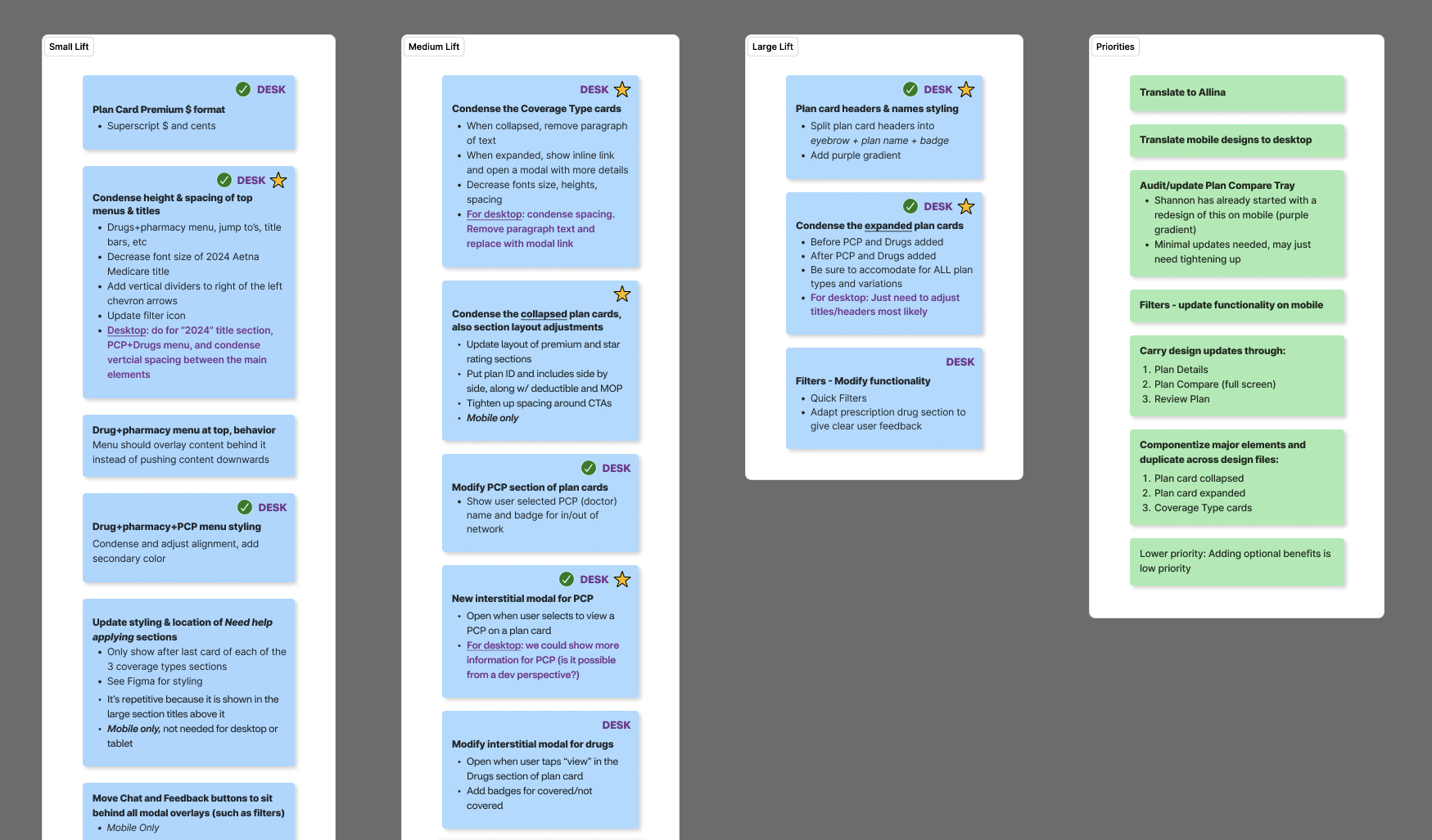 Next, we met with the Lead Developer and categorized the tasks into small, medium, and large dev lifts, then prioritized them based on user needs and project goals.

 I work directly with Aetna's large scale design system called Digital Pulse (shared with CVS Health) that includes brand color scales, type scales, and an icon library. It also includes foundational components such as nav bars, cards, modals, text fields, input controls, and buttons.
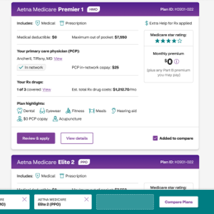
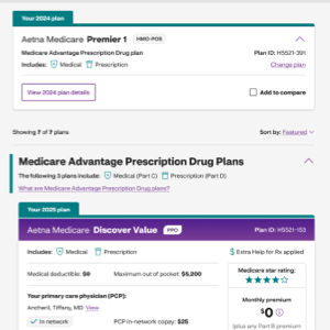
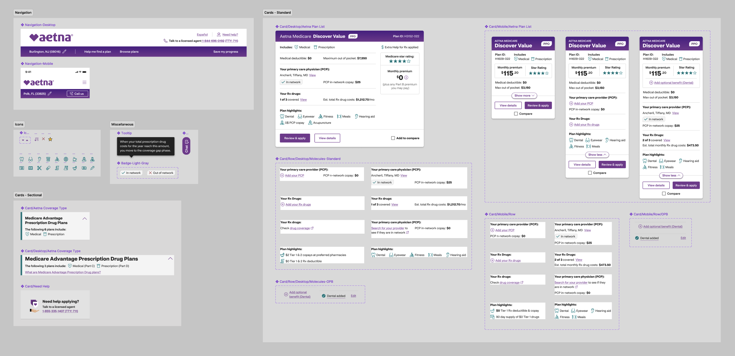 In my working file I linked to the color, type, and icon library as well as the components library which I used as building blocks to create local component templates specific to the Aetna shop, buy, and enroll experience. For example, I created variant components for plan list cards (using auto layout) composed of rows of content that can be swapped in and out for numerous use cases. Examples of plan cards for mobile before and after the redesign here.

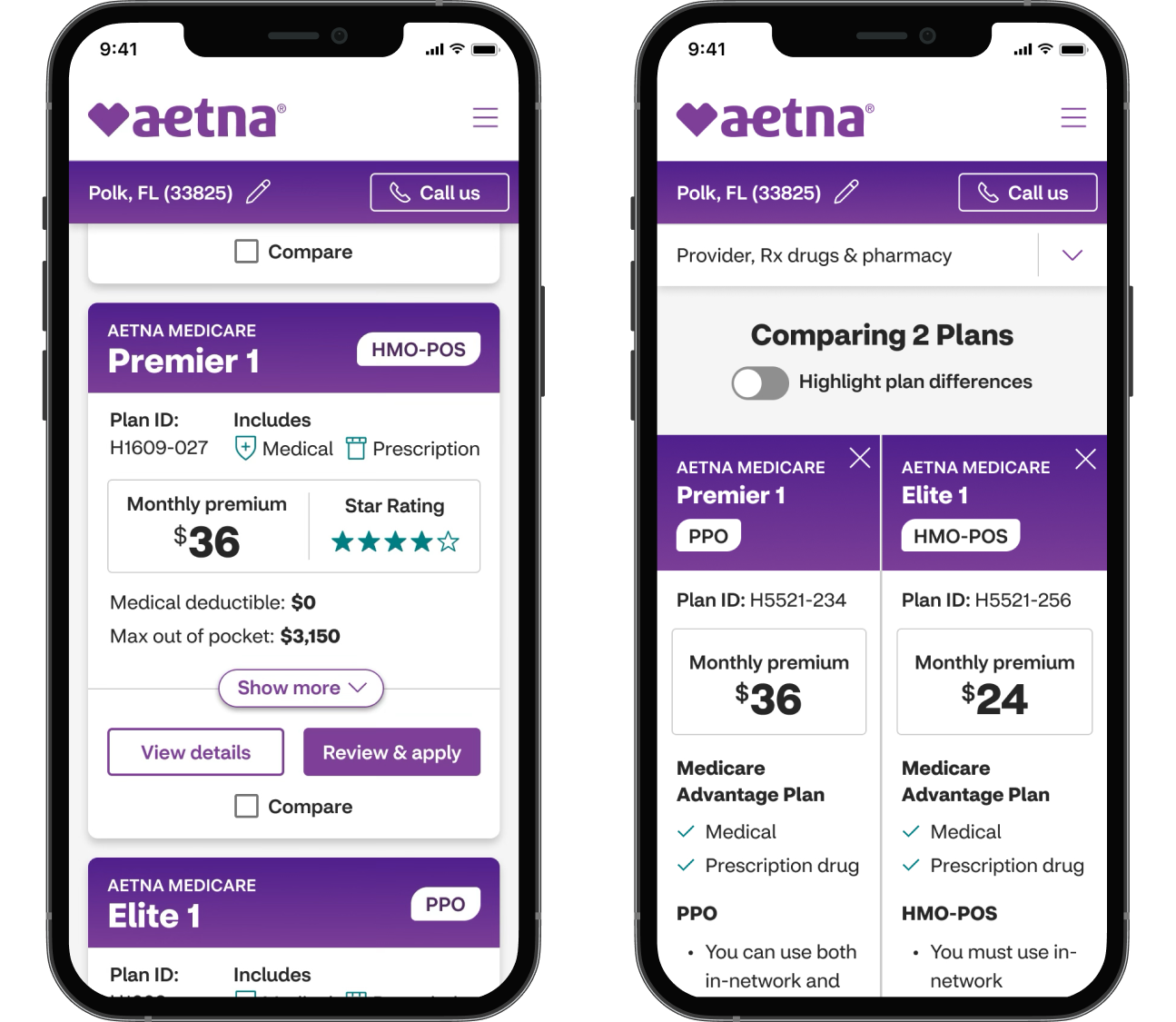
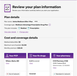
Informed by the user research, reqs from stakeholders, and the design system, I used the local components to design UI mockups starting with mobile (phone) breakpoints. I dynamically swaped states of the components (for example, the plan cards expanded vs collapsed) to create accurate prototypes for demos and user testing. The design system paired with auto-layout saved many hours in building both the hi-fi mockups and the prototypes.
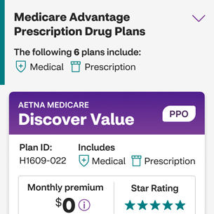
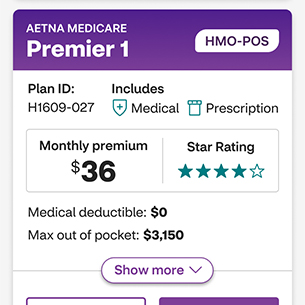
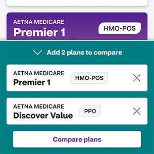
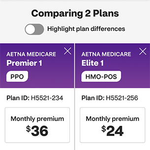
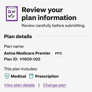

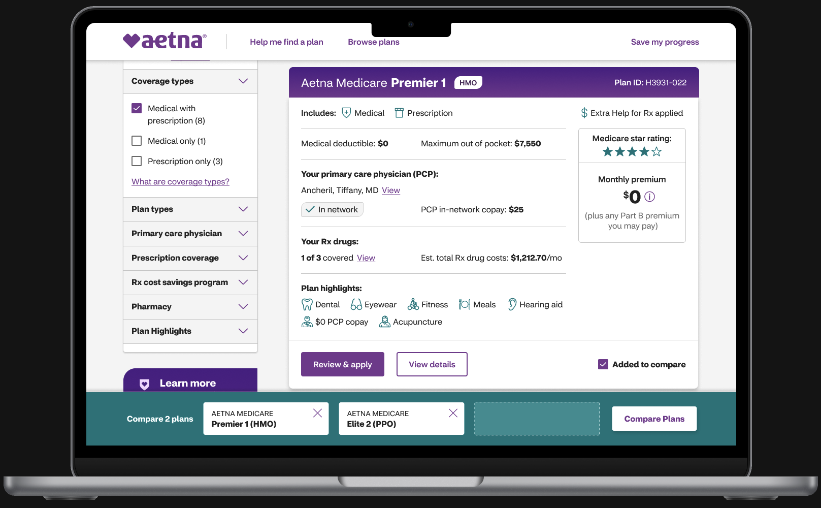
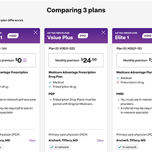
Using the mobile design improvements as a starting point, I expanded the UI out into desktop breakpoints. Desktop and tablet landscape expand to a 2 column layout where filters and plan cards can be used at the same time. Users can also compare 3 plans instead of 2 and explore more plan info at once. Above shows the plan compare feature.

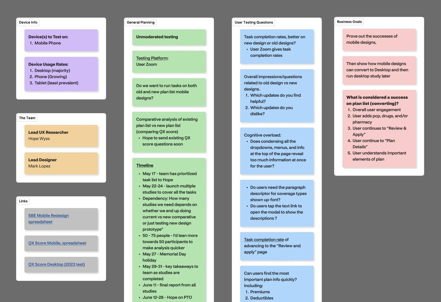 After the first round of UI designs, I partnered with the UX Research and wrote a high level A/B testing plan (see above) to compare the live/current plan list design with my redesign. We wanted to test that users can reach their goals efficiently and that the redesign is an overall improved experience. Next I created realistic prototypes in Figma from which the UX researcher ran unmoderated user tests in UserZoom.
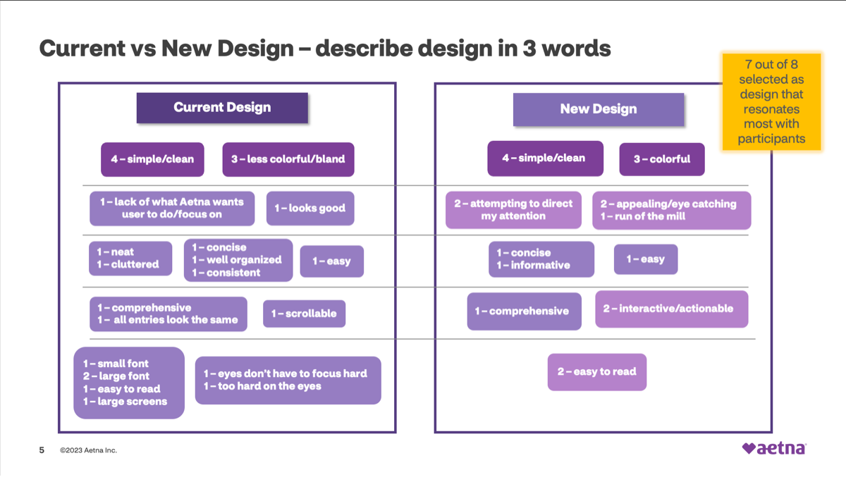 We started with a small user base of 8 for a talk-out-loud test to gain qualitative data of user sentiment (see image above). Results found that 7 of 8 users preferred my redesign for it’s eye catching UI and concise, actionable content. Next, we expanded out to 33 users for the unmoderated A/B test in UserZoom. This test found that 15 of 16 users succeeded (from the sample group) in finding the Details & Apply buttons for their desired plan. However, success rates were lower for finding the Compare plan button and entering the compare experience.
Therefore, I went back and revised the prototypes to emphasize the Compare buttons more as well as making the compare bar (at the bottom) stand out with color, and then we retested. The 2nd test found that 8 of 10 users succeeded in comparing plans, a major improvement. Overall, the redesign received acclaim from stakeholders & users and will be released to production for the 2024-25 open enrollment period.


